
Let’s Eat
Decisions about what and where to eat when you need it most.
OVERVIEW
Before 2017, I was a self-taught UX designer, and I wanted to formalize my training and continue practicing my skills to complement my years of experience working in the field. I chose to undertake the Springboard UX Career Track program, which covers design thinking, user research, wireframing, UI design, prototyping, design sprints, and more. This case study is the project I worked on throughout the course.
ROLE:
DURATION:
1 month
Tools:
Sharpies & paper, excel, white board, Sketch, Photoshop, Invision
Viewing the prototype your mobile phone? Follow this link for a better prototype experience.
The Problem
Food. We love it; we need it, we enjoy it. But It’s hard to decide on. The day after a friend's 30th birthday extravaganza, it was Sunday, and I found myself waking up at 2 PM with a nice hangover. The only thing on my mind was food, so I turned to Uber Eats for what I thought would be an easy task. After 45 minutes of browsing restaurants, menus, and deliberating dishes, I found myself unable to pick a dish. At this point, I gave up on Uber Eats and drove to Chipotle.
After eating, I thought about other times where there was indecision around where or what to eat. There have certainly been flare-ups with family and friends when everyone wanted to go somewhere different. This led me to uncover why this problem existed.
Problem Statements:
Food delivery apps offer too many choices which lead to decision fatigue.
It is hard to pick a place to eat when a large group is involved.
User Research
To investigate how others deal with making decisions about what and where to eat, I created a research plan. The goal of the research was to answer the following questions:
What caused me to go into a 45-minute daze of searching through menus?
Do other people have this problem, and when does it arise?
What solutions and tools exist to alleviate or eliminate this problem?
To answer these questions, the methodology consisted of first sending out a survey to recruit participants and conducting secondary research until the results came in. The survey received 16 responses, and I conducted 7 in-person interviews.
Secondary Research
Decision Fatigue
People make 35K Decisions a Day and 226.7 are on food alone.
Decision fatigue is the newest discovery involving a phenomenon called ego depletion - NYT - which is the ability for the self, or ego, to deplete mental activities involving the transfer of energy. In other words, there is a finite store of mental energy for exerting self-control and making decisions. This leads to:
Impulsiveness – Leverage the first option you are given and be done with it.
Compliance – Going with the most pleasing and popular option as it pertains to those impacted.
Delegating – Pushing decisions off to capable and trusted others
Once you’re mentally depleted, you become reluctant to make trade-offs (deciding), which involve a particularly advanced and taxing form of decision making. In a mentally depleted state, our brains become paralyzed when faced with more and more choices. This leads people to make simple, snap judgments to avoid the hassle of wading through confusing options.
Research also shows that an excess of choices often leads us to be less, not more, satisfied once we actually decide. There’s often that nagging feeling we could have done better.
Number of Restaurants on Food Delivery Apps in San Diego:
Uber Eats - 123
Door Dash - 368
Seamless - 500+
Grubhub - 500+
Postmates - 168
Eat24 - 500+
Menu Size
The average menu size (# of items) across all restaurants is 92.6. For newly opened restaurants the average menu includes on average 59.4 items.
Primary Research
Interviews
I conducted seven interviews with participants that fit the eligibility criteria:
Goes out to eat or orders food for delivery at 3-4 or more times per month
Uses apps when ordering food delivery and for deciding where to go out to eat
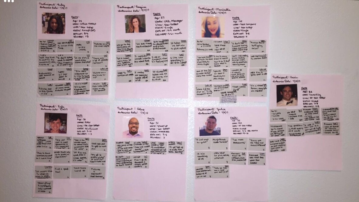
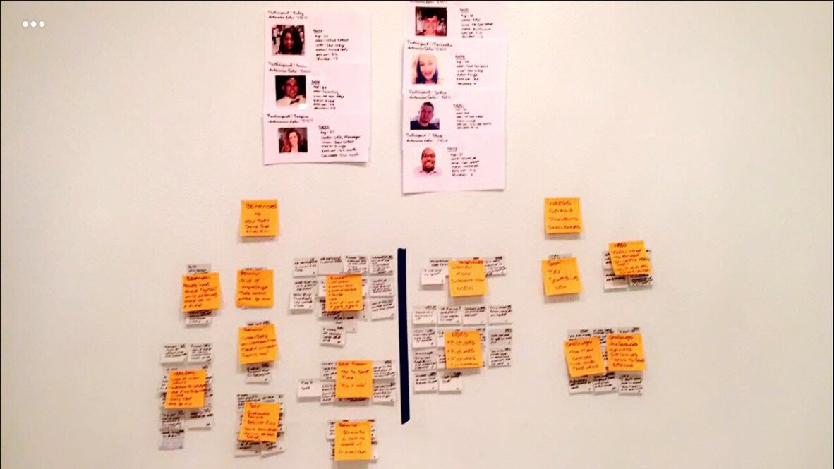
Data Synthesis
After the interviews, I reviewed my notes and audio and extracted relevant behaviors, needs, goals, and quotes. I then clustered and categorized the information.
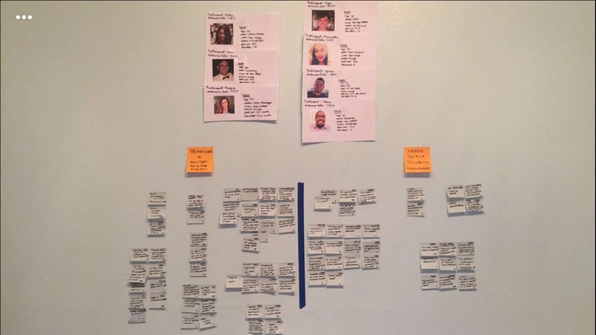
Themes
After clustering the data, I added a theme to each cluster so I could see what the high level learnings were.
Interested in the details? See my user research data synthesis report, or refer to the persona section below.
The Competitive Landscape
Competition
I examined all apps and websites that help attain food or help with the food search/decision. The apps and websites on the left help pick (reviews/discovery) food to eat, but there is an issue with usability and the fact that there is not enough information on the dishes. For example, most people turn to Yelp for recommendations and discovery, but the poster's personal preferences may not match the person's personal preferences searching for information. In the Yelp example, the usability issue sets in when someone posts a picture of a dish that the user may like but does not include its name, so the user is left guessing. The apps on the right help with attaining food, but it comes with decision fatigue. People want to try something new, but they need pictures and detailed descriptions to help them.

Heuristics
As mentioned above, the usability of apps in the landscape of food discovery and acquisition is low across the board. For details, please see the Let's Eat Heuristic Analysis. As part of my heuristics analysis, I included categories as pictures, descriptions, and ingredients, as those were important factors to interviewees when deciding on what or where to eat.

Design Strategy
Persona’s and Empathy Maps


The Solution
User Stories
I created user stories for key features to test in the MVP: account and log in, the first experience, swiping of dishes, what to eat, group decisions, and inviting friends to make a decision. For the full spreadsheet, click here.

Information Architecture (IA)
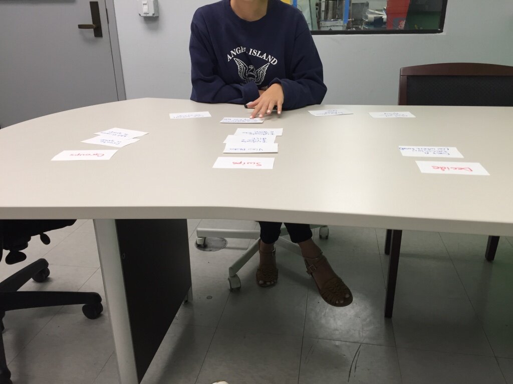
I performed a closed card sort with five participants. Two of the five participants correctly placed the cards in their intended group. The remaining three participants placed 1-4 cards from the groups section into the decide section, or we're unsure of which section to place it in. After inquiry, I understood that the confusion came from the fact that we need to make a personal decision about what dish to eat and make a group decision about what restaurant to eat at. The naming of the decision tag confused the participants. After explaining the correct architecture, I asked the participants to rename the tabs. The changes to the high-level architecture can be found in the site map diagram below.

Original IA naming convention:
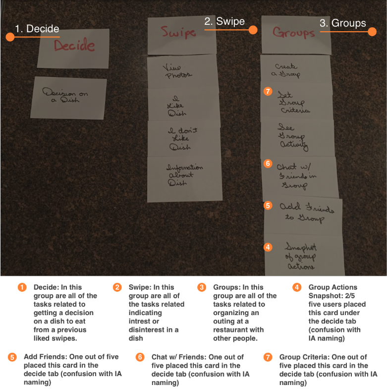
Final IA naming convention per user card sort:

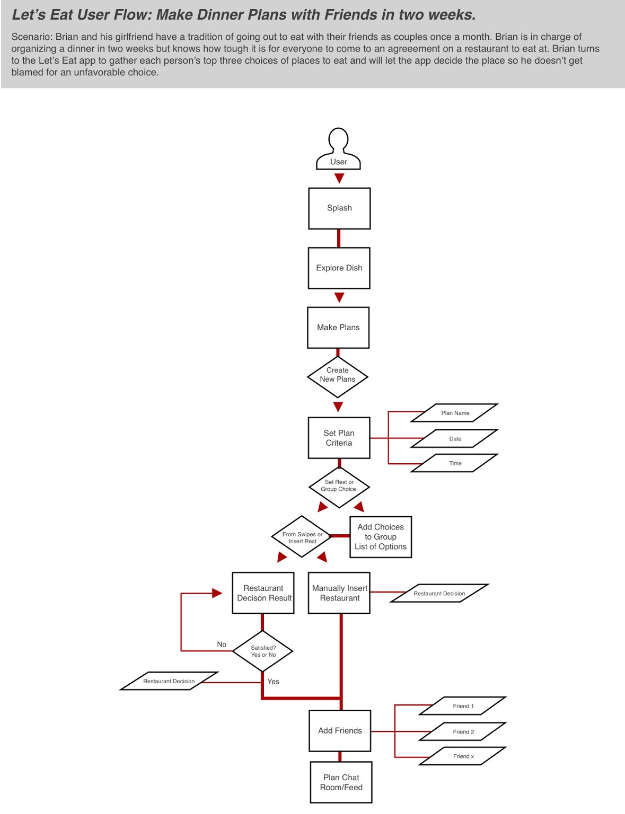
Scenarios & User Flows


Sketches & Wireframes


Style Guide


Main Screens

When a user needs a decision on what to eat, they click the get decision button; then the wheel randomly populates dishes they’ve previously swiped yes to and provides them a dish.

Users swipe left (no) or right (yes) on dishes from various restaurants to build their preferences and populate dishes for the Eat This tab.

When a group decision needs to be made, the user creates “plans” and affords everyone to add their top options to eat and then provides the group with an equitable decision.
Play with the interactive prototype by clicking here.
View Related Work
Or, ready to work together? Contact me.